Using Indesign
- Sep 16, 2015
- 2 min read

This is me pratecing in 'indesign'

I like this poster because the use of colour stands out, the poster pops with a simple white on black colour text box and and mutlicoloured image. 'Don't Panic' springs out of the page when they ask you a quritrical question, it also is a diffrent colour. The logo 'self made' is in a hexagon and the shape is plastered all over the main image, this reminds me that I am looking into a window and that it maybe exclusive. I don't like the image used because this is not my sort of thing.
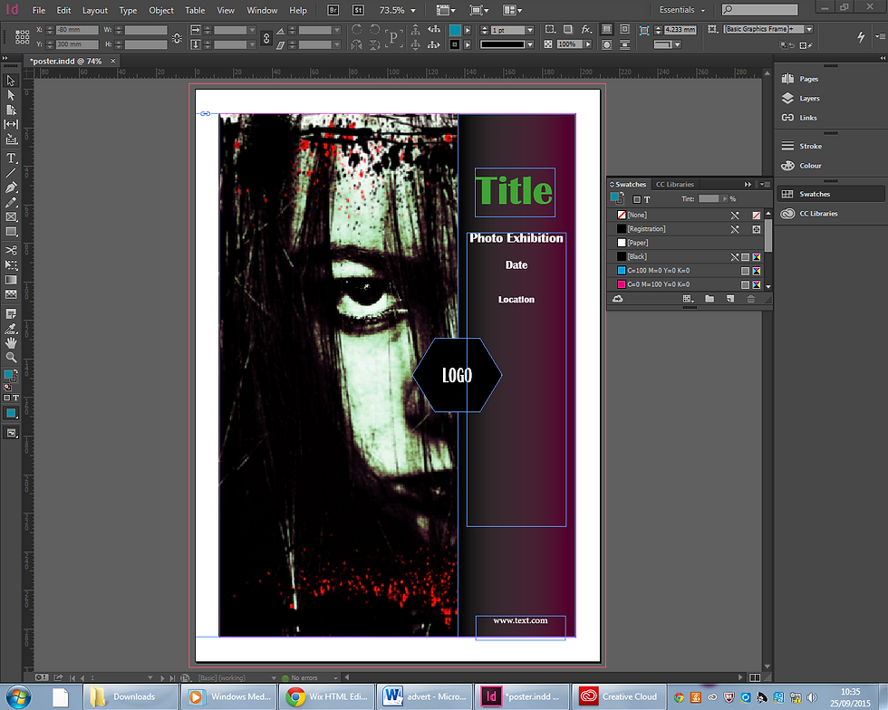
This is my own rough layout inpired by the 'Don't Panic' poster.
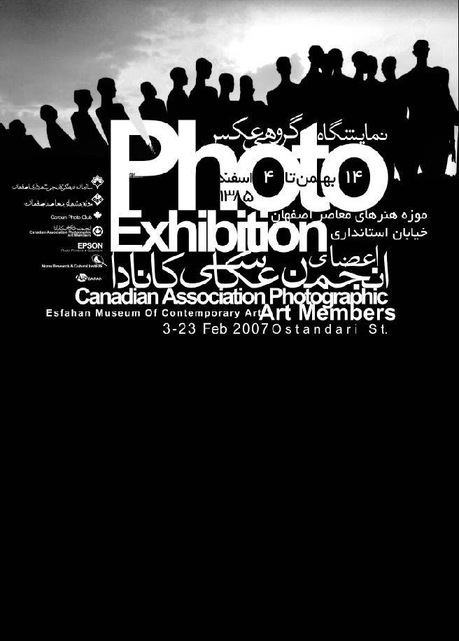
I like that the poster has diffirent lauges but it is dicised in the bold text 'Photo Exhibition'; I think this brings a bigger range of people to this exhibition! The silhoute people are lining up for something but this poster doesn't give much away of what is at the exhibition. I don't like that there is not some colour in this poster and i think it would have stood out more with a splash of colour.

This is my rough layout inpired by the poster above.
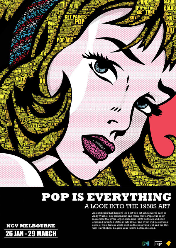
I love the pop art picture that stands out from the rest of the poster and when you look closer you can see the colour of this picture is made with diffrent coloured words. At the bottom of the image is the informastion about the exhibition with a simple black and white colour the title stands out with its size.
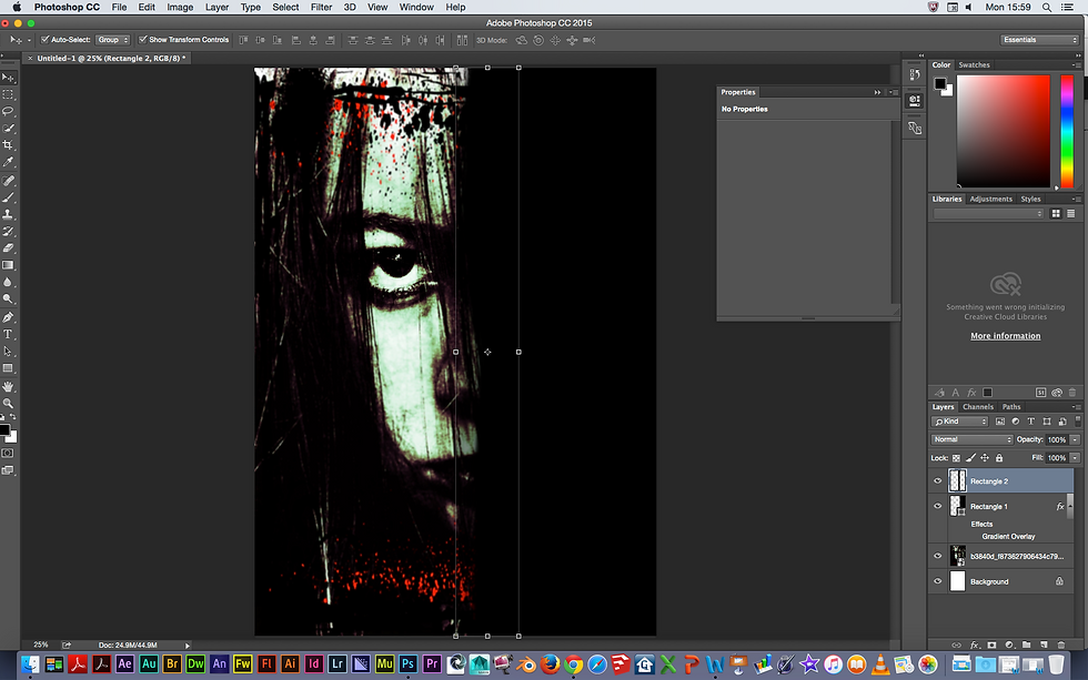
This is the image I made in photoshop. I am going to do the rest in 'indesign'.
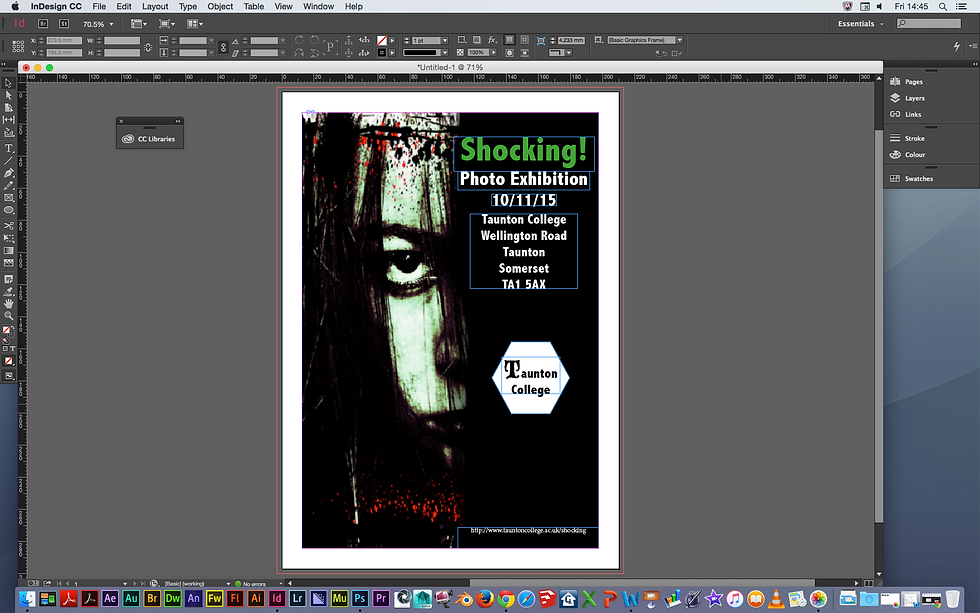
Final Poster in 'indesign'.


Comments